Logo Project
The Brief
Zugrăvim Zilnic is a Romanian business specializing in interior and exterior house painting. Based in the country's capital, București, they operate in a market where the competition is fierce, and so is the demand. To stand out, Zugrăvim Zilnic relies on their promptness and dedication. Their name reflects both their niche and their values, roughly translating to "Painting Every Day".
Their values are promptness, seriousness, and dedication.
Their clients are people with mid-to-high budgets who want fast, quality painting work.
The Process
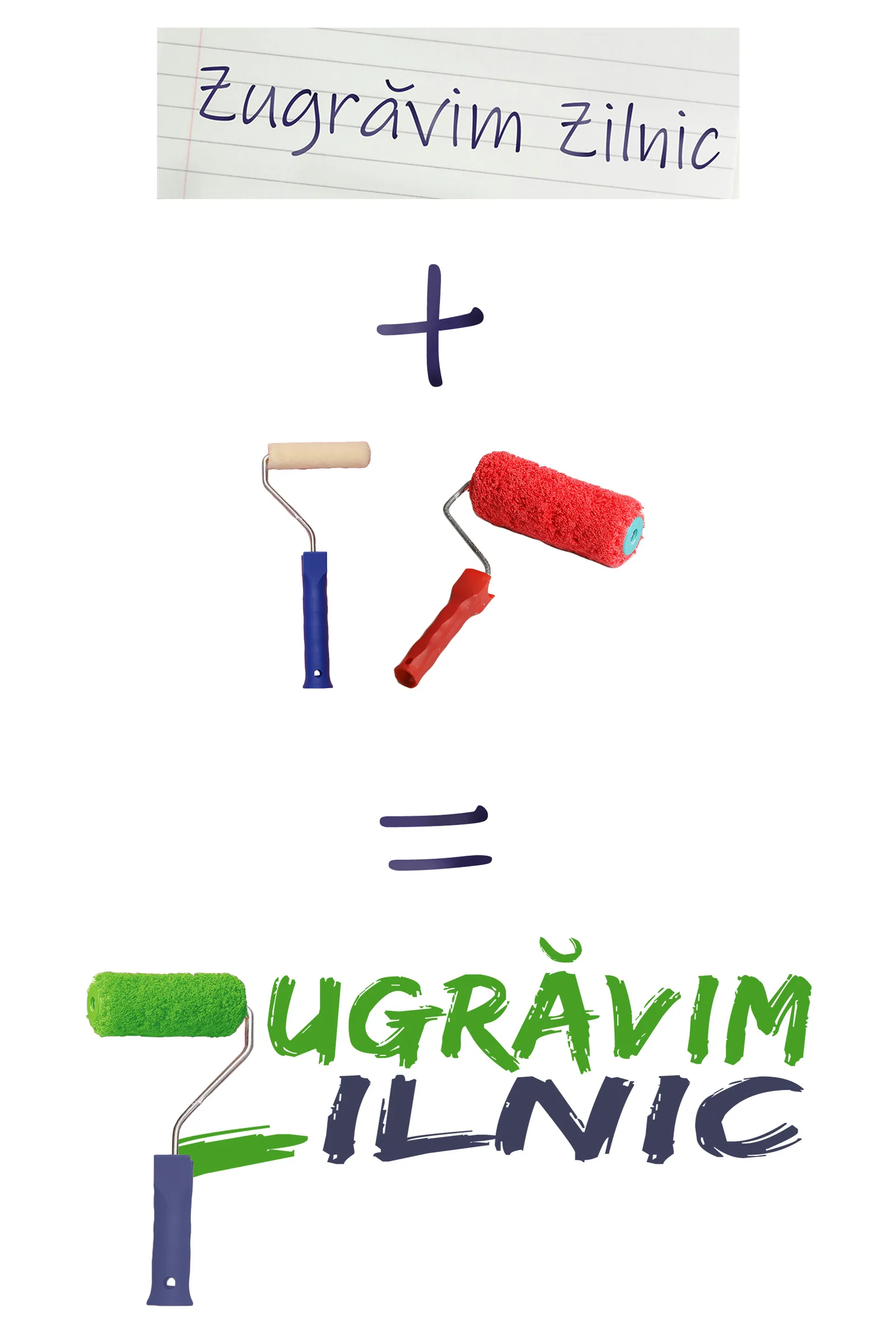
Considering the business's mission, values, and target audience, we set out to create a clear, practical, and simple logo. Because the core of their identity lies in their name, which already communicates their niche, we decided to feature the business name prominently and legibly.
The next step was to ensure viewers could understand the nature of the business within the first five seconds. One way to achieve this was to incorporate a recognizable element that conveys the area of expertise.
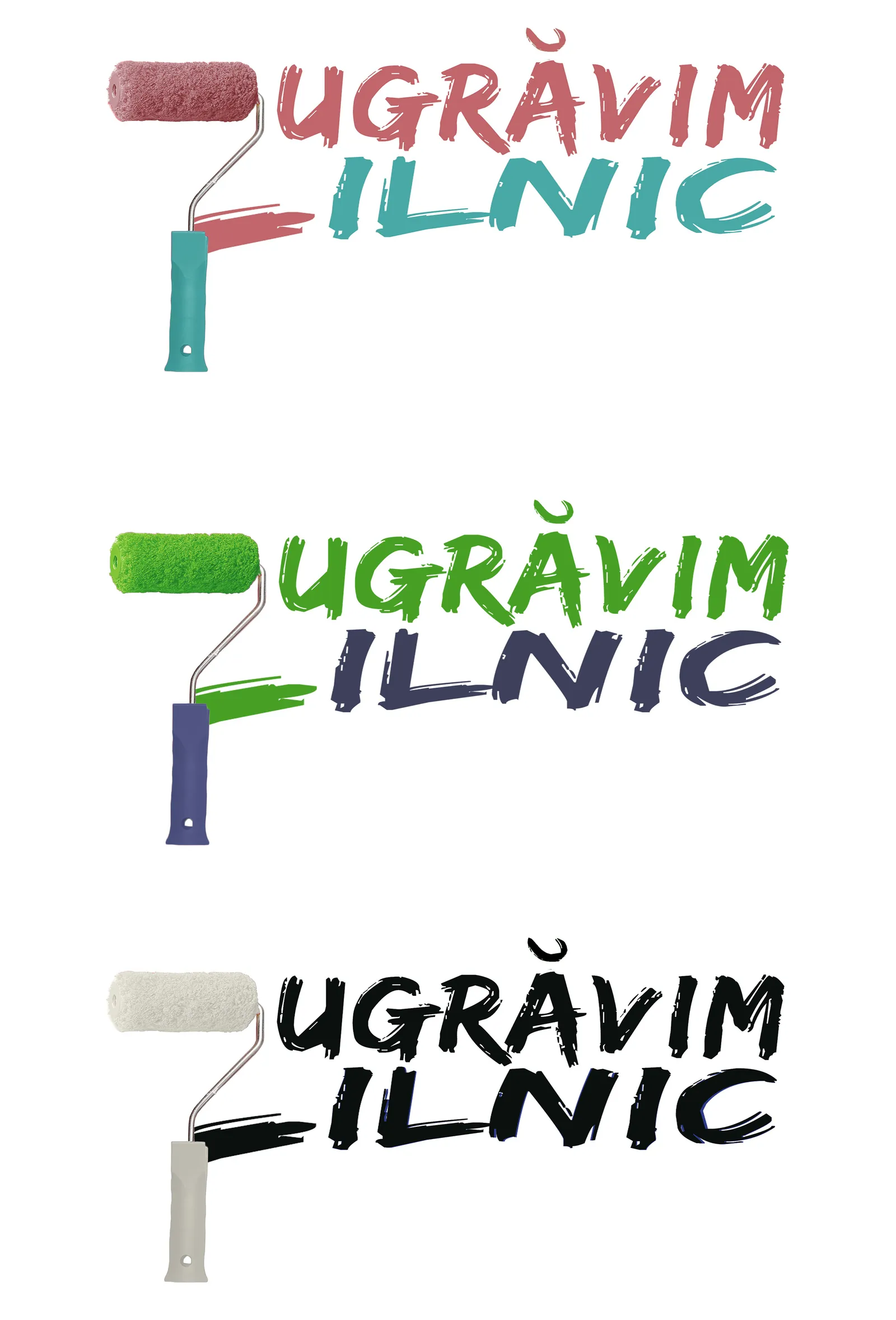
After brainstorming, we decided to use a paint roller, an object instantly associated with wall painting. We narrowed it down to two stock images of rollers, then combined them to create the perfect one. The most challenging part was connecting the roller to the text in a way that felt natural, and after several trials we landed on the winning idea: making the text look like it had been painted.
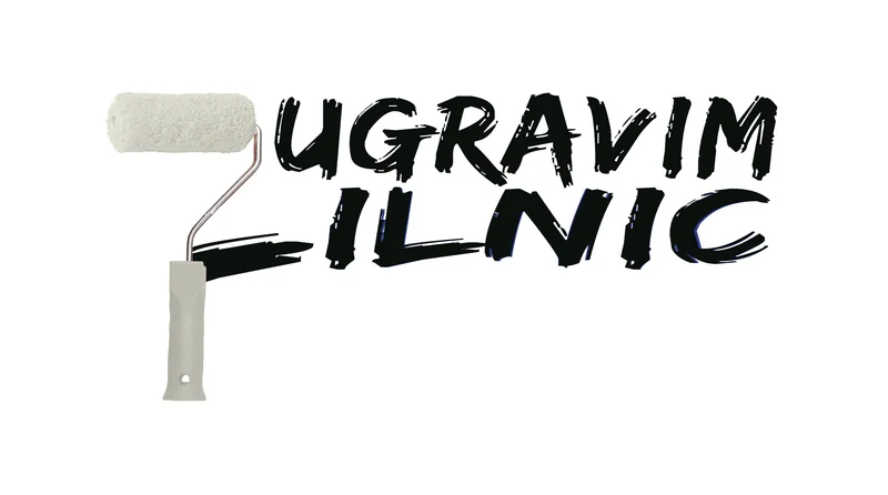
To reinforce this connection and draw the viewer's attention, we made a small compromise on the legibility: we removed the first letter from both "Zugrăvim" and "Zilnic", then shaped the roller into a "Z" by adding a splash of color on the right.
The Results
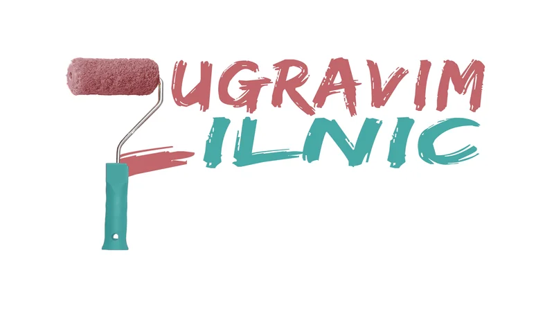
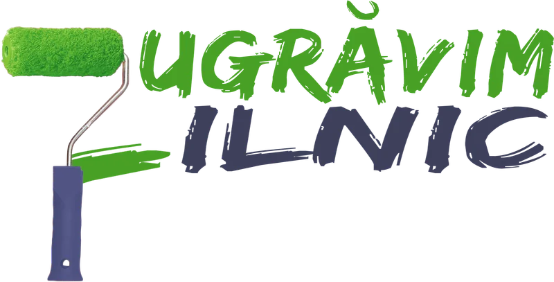
To create the desired effect, we chose a fitting typeface and matched the roller's color to the first word, "Zugrăvim", which means "Painting". To add visual rhythm and dynamism, we picked a second color from the palette for the word "Zilnic", and colored the roller's handle to match, creating balance across the mark.
We created three final versions. Two followed this approach using different color sets: the first was a pastel palette with pink (#C1666B) and blue (#48A9A6); the second used bold, high-contrast colors: vivid green (#47A025) and dark blue (#3D405B). In terms of color strategy, the first felt safe and approachable, while the second conveyed boldness.
For the third option, we took a different direction and went with black and white: black text with a white roller. The result was clean and minimal: white paint as pure coverage. This version offered a classic, high-contrast look.
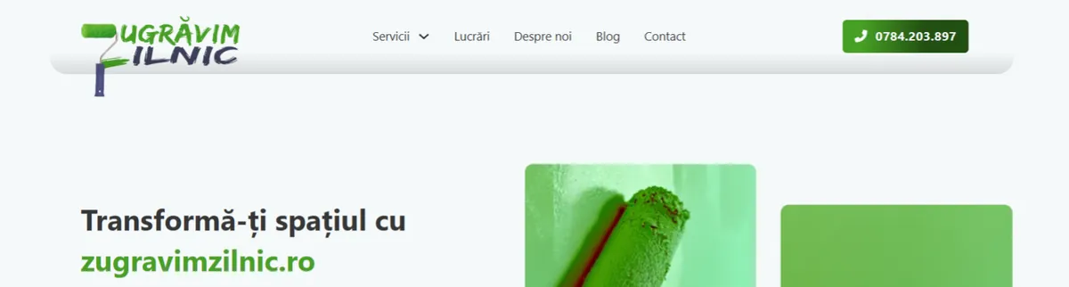
In the end, the client opted for the second version, the bold option. Once placed on their site, the handle was positioned outside the header, adding a nice finishing touch.