Digital
We had been creating weekly catalogues for an online grocery store, designed with structured grids and multi-page layouts that worked well for both print and digital distribution. The format delivered all the information clearly and consistently.
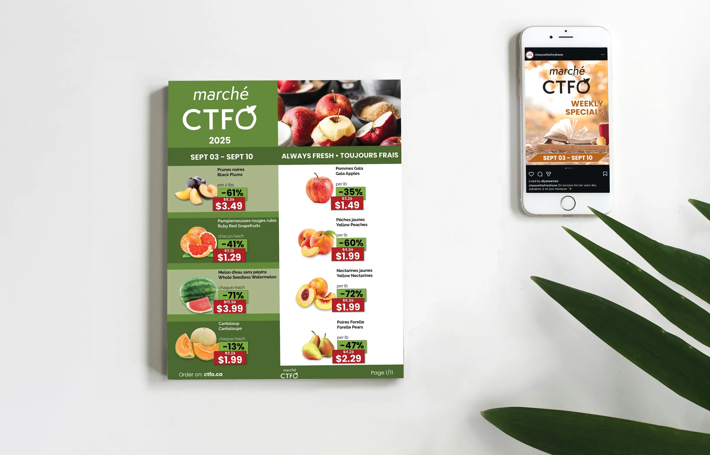
Over time, we recognized that an 8 to 14 page catalogue, no matter how well designed, was not the right fit for social media. Platforms like Facebook, Instagram, and TikTok are built around short-form content, reels, stories, and quick scrolls. Audiences on these channels simply don't stop to browse through multiple pages of promotions. We needed to rethink the format entirely to match the way people actually consume content on social media today.
We opted for a carousel format: a compact, swipeable series of slides that presents a curated selection of the week's best offers. Instead of trying to fit everything into one post, each carousel works as a teaser, highlighting key promotions with limited, focused information designed to spark interest quickly.
Every slide is built with bold product imagery, clear pricing, and consistent branding. The layout is optimized for mobile screens and designed to feel native to Instagram, Facebook, and TikTok. We also established a recognizable visual template so that followers could instantly spot the store's weekly promotions in their feed.
The shift to carousels gave the store a more modern social media presence, with higher engagement and more shares. By keeping the content concise and visually driven, we met the audience where they are and matched the pace at which they consume content.